2019 Design Exercise - UI/UX Design
College Orientation - Motion Billboards

Overall Design Requirements
For this design exercise, I have the following criteria:
- Orientation Team needs assistance on digital billboard
- Seen in various places on monitors around campus
Target Audience
- Incoming Students/Families
Information Needed
Orientation Day Info - Point Park Website
Student Organizations
Events

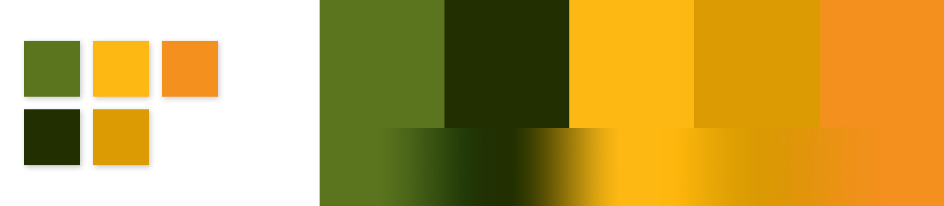
First things first. Does Point Park University have a style guide? Yes!
Color Palette
Next, it's time to start exploring and gather ideas for my digital billboards.
I recently began using Pinterest for this process, as it helps me funnel all of my ideas
into one place.
Check out my Board for this project here.

Option 1 - The Stack
For the stack, I want big and bold to be the keywords.
The large blocks of color work perfectly to create eye-catching signage.
The blocks are modular and can slide, push, pull, or stack related video and photos around with them to reveal new areas of the screen. Underneath new layers of the stack, you can see important information on the day's activities.
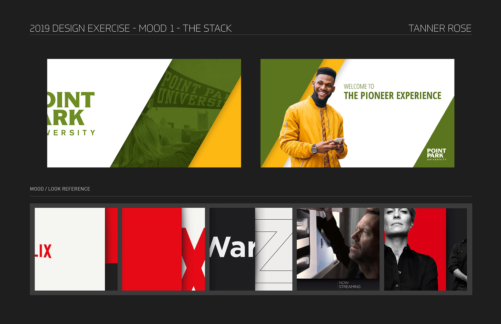
For this piece, I would like to take the sliding bars from Netflix and use them in interesting ways to highlight important information for the two-day orientation.
The bold, bright color scheme and ability to use school photos, videos, and branding can bring a customized feel to the billboard.
The Stack - Final Loop
Loop is :30 seconds in length, and begins and ends with the Point Park University Logo.

Option 2 - Duotone
In "Duotone," I really wanted to capture the vibe of a young social media influencer.
Duotone style is on the rise in 2019, and a quick search reveals that Spotify is one of the larger trendsetters today for duotone photos and album covers.
I feel that this would be the perfect billboard to snag the attention of the incoming students for its hip and trendy style.
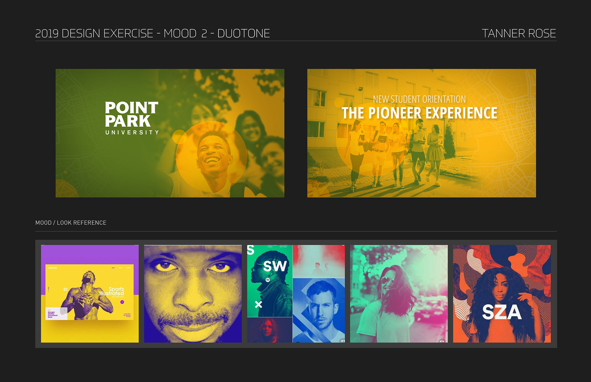
Duotones are on the rise this year, so I felt it best to include it while it is topical.
Many companies have started using this style in a lot of their branding.
I really wanted this design to feel modern.
As students walk into school the first day and see this billboard in their dormitory lobby, the cafe, or hallways I want them to think, "Wow! This place is cool!"
Duotone - Final Loop
Loop is :30 seconds in length, and begins and ends with the Point Park University Logo. This one is my personal favorite!

Option 3 - UI
"UI" Is supposed to be clean and simple, evoking a futuristic frosted-glass feeling.
The yellow bars will never leave the screen, moving and resizing to help accommodate content.
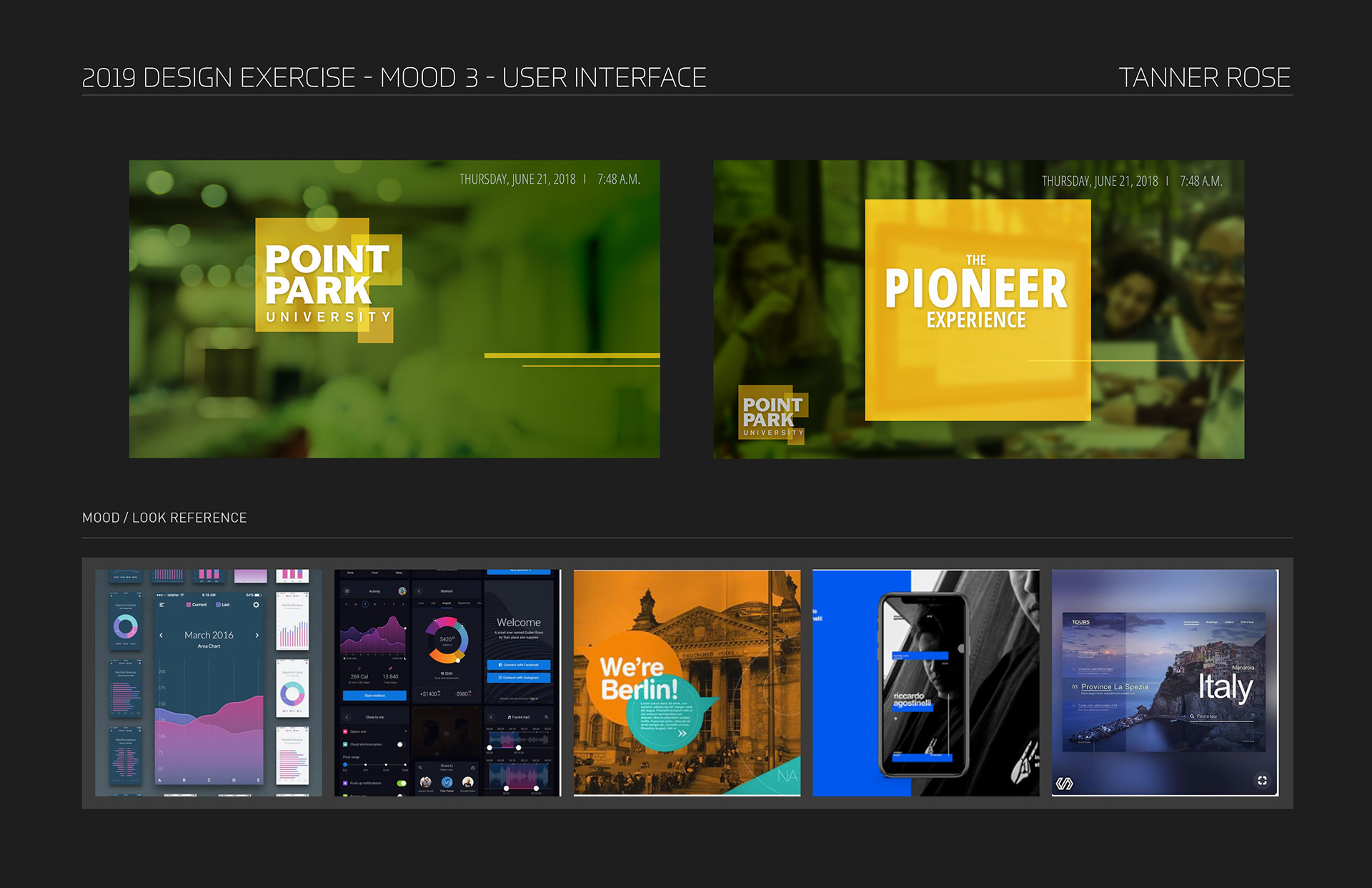
Let's keep this one nice and simple. Just some yellow shapes displaying content!
UI - Final Loop